
Case Study
Wanderpath
2025
Usability tests | Wireframes | High-fidelity prototype | Qualitative research
Wanderpath is a persuasive UX travel planning platform that helps young travelers aged 18–34 discover lesser-known destinations, and gently nudges them away from overvisited hotspots.
Created as my graduation project for the Master in Media Innovation, the platform combines ethical persuasion and personalization to encourage more mindful travel decisions. Rather than limiting users, Wanderpath makes users curious: “What if you went here instead?”
Based on existing literature, primary user research insights, and persuasive design theories, Wanderpath combines functionality with responsibility to make sustainable travel feel like an exciting choice, not a compromise.
My Role
UX Design, UX Research, Concept Development, UI Design
Duration
March – June 2025 (14 weeks)
Project Type
Graduation project/self-initiated
Tools Used
Figma, Notion, Adobe Illustrator
1. Empathize
User Survey
Firstly, I conducted an online survey to gain insights into young travelers’ interests in visiting lesser-known destinations, how they currently plan their trips, and what could be improved. The survey sample consisted of 44 respondents aged 18 to 34.
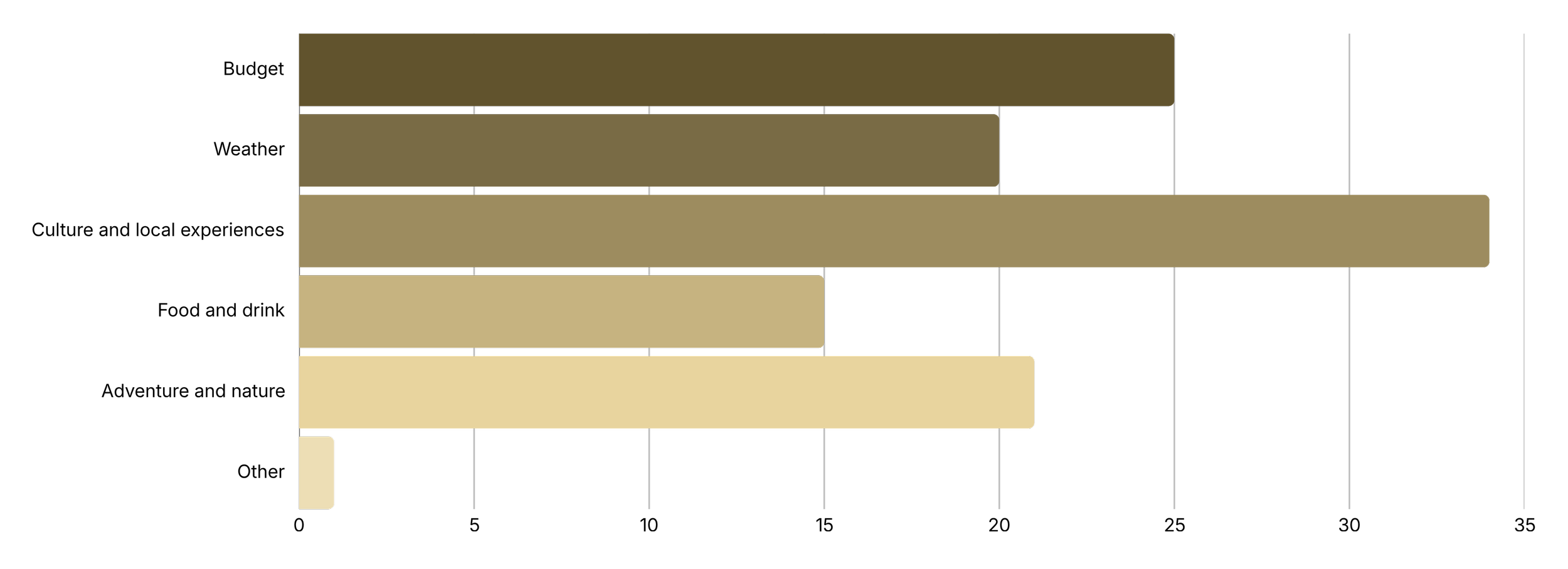
When respondents were asked about their most important motivators for choosing a destination, the top three answers were culture and local experiences (34 votes), budget (25 votes), and adventure and nature (21 votes).

A striking 89% of respondents (39 out of 44) indicated that they would “definitely” be open to exploring lesser-known destinations if they align with their interests (e.g., culture, nature, food). Only 11% (5 respondents) entered “maybe,” and none rejected the idea. This showed that there is a potential for travel platforms to promote alternative destinations if they are relevant and tailored to travelers’ interests.

The survey included a ranking question for their ideal travel tool features. Participants ranked the features from most to least helpful. The feature “personalized suggestions based on interests (e.g. culture, weather, food)” was ranked as most useful. This suggests that the core concept of the travel planning tool appeals to the target group. Other features like setting estimated costs and discovering local events or hidden gems were also appreciated.
The complete results of the survey can be found in the Wanderpath Thesis.
Target group
The idea is to create a platform for travelers aged 18 to 34 who enjoy discovering places that feel unique and aligned with their interests. This group is curious, visually oriented, and interested in experiences that reflect their own identities. This group prefers mobile, intuitive interactions and expects digital tools to adapt naturally to their preferences. They value discovery that feels effortless and aesthetically pleasing without needing to adjust many settings or complete long onboarding steps.
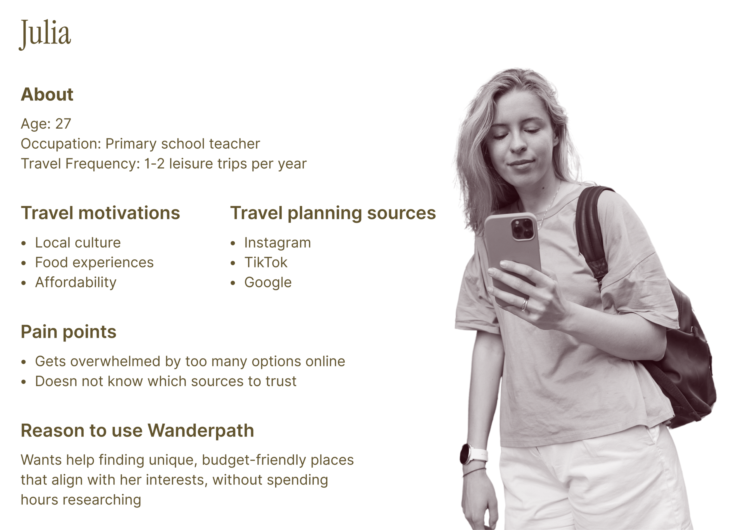
User persona
Market trends
Planning digitally
Personalization
Authenticity
Younger travelers plan and research primarily through their phones. Social platforms like Instagram and TikTok play a major role in early discovery, influencing where people choose to go and what they perceive as worth visiting. Personalized digital experiences are becoming standard expectations, and users are gravitating toward apps that adapt to their interests. At the same time, interest in new, authentic destinations continues to rise, with a growing demand for experiences that feel unique and cultural.
2. Define
Problem & Market
Problem statement
Young travelers want authentic, low-impact travel but face two main barriers: excessive tourism, which makes popular destinations too crowded, and choice overload from the overwhelming travel content online. Finding trustworthy and alternative destinations that suit their interests takes time and effort and can be mentally exhausting. Young travelers need a simple way to discover destinations online.
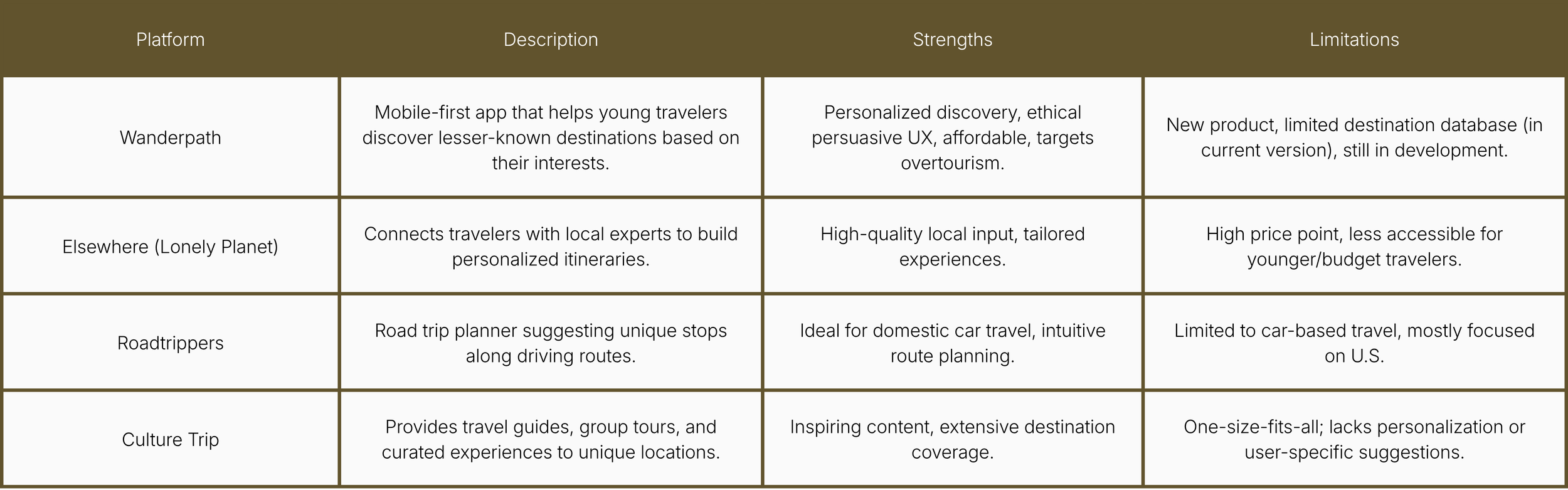
Market gap
Although there are many travel platforms, none provide a personalized, mobile-first experience that shows lesser-known destinations while reducing choice overload. Most existing platforms focus on offering options based on popularity or commercial potential, or are not personalized to users’ needs and interests. These tools do not make alternatives easy or intuitive to explore.
Competitive Analysis
To compare Wanderpath with its direct competitors, I analyzed the strengths and weaknesses of similar platforms.
Research Insights
Key insights
Travelers struggle to judge the value of lesser-known destinations
The early inspiration phase is scattered across different apps
Users want relevant options fast, without too much effort
User needs
Need for clear, trustworthy information about unfamiliar destinations
Need for personalized discovery
Need for intuitive navigation without extra cognitive effort
Design Requirements
The tool must show personalized recommendations
The interface must feel simple and visually clear
Destinations must be easy to find and navigate through
The tool must reduce friction in the early stages of travel planning
The focus on showcasing lesser-known destinations must be clear
3. Ideate
Concept Direction
Based on the research insights, the initial concept direction is focused on reducing the complexity of early trip planning.
Discovery based on interests
Visual and mobile-first
Clear destination overviews
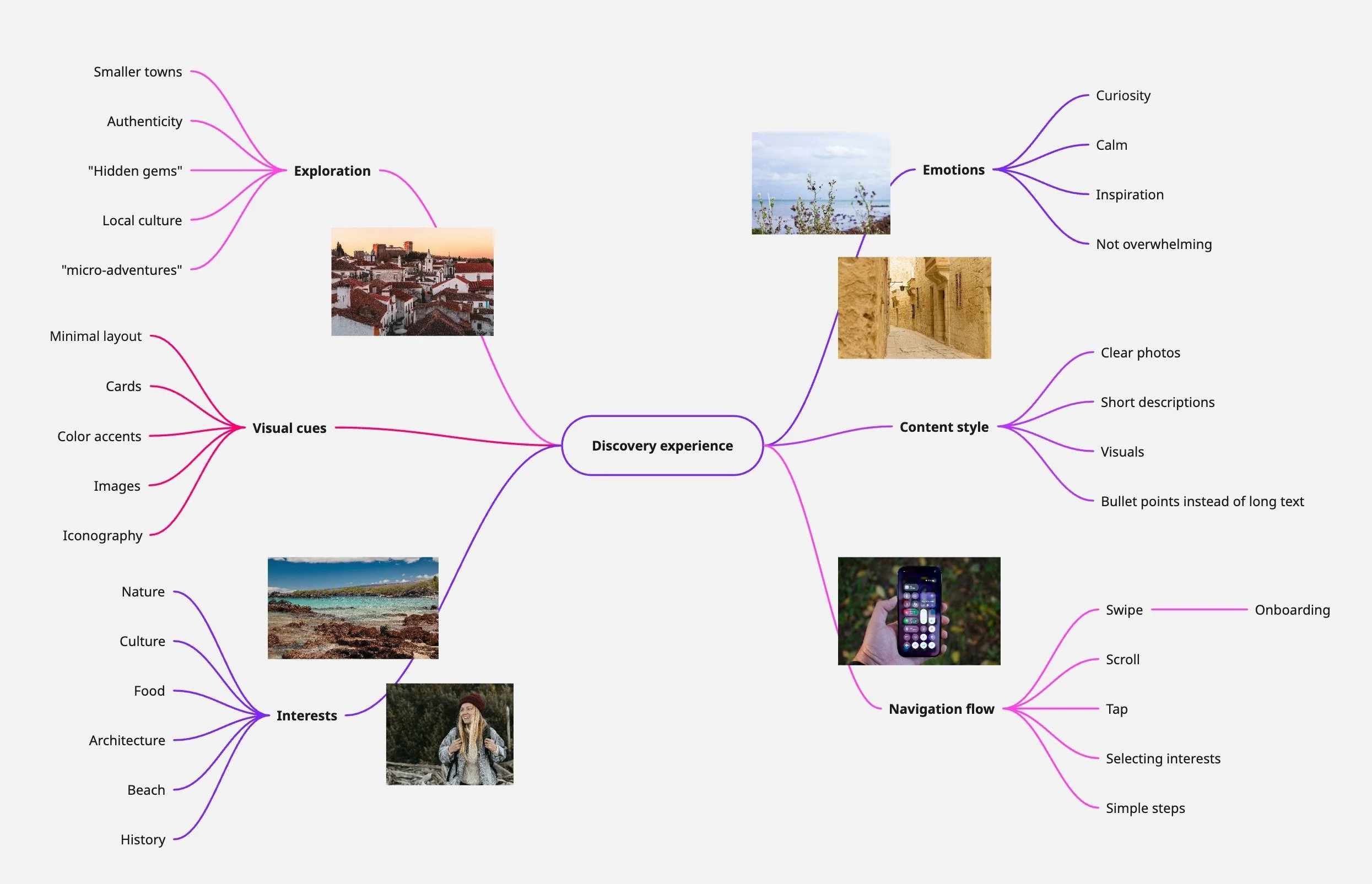
I created a mind map with the important details to consider when designing the discovery experience, such as the visual cues, emotions and content style of the platform.
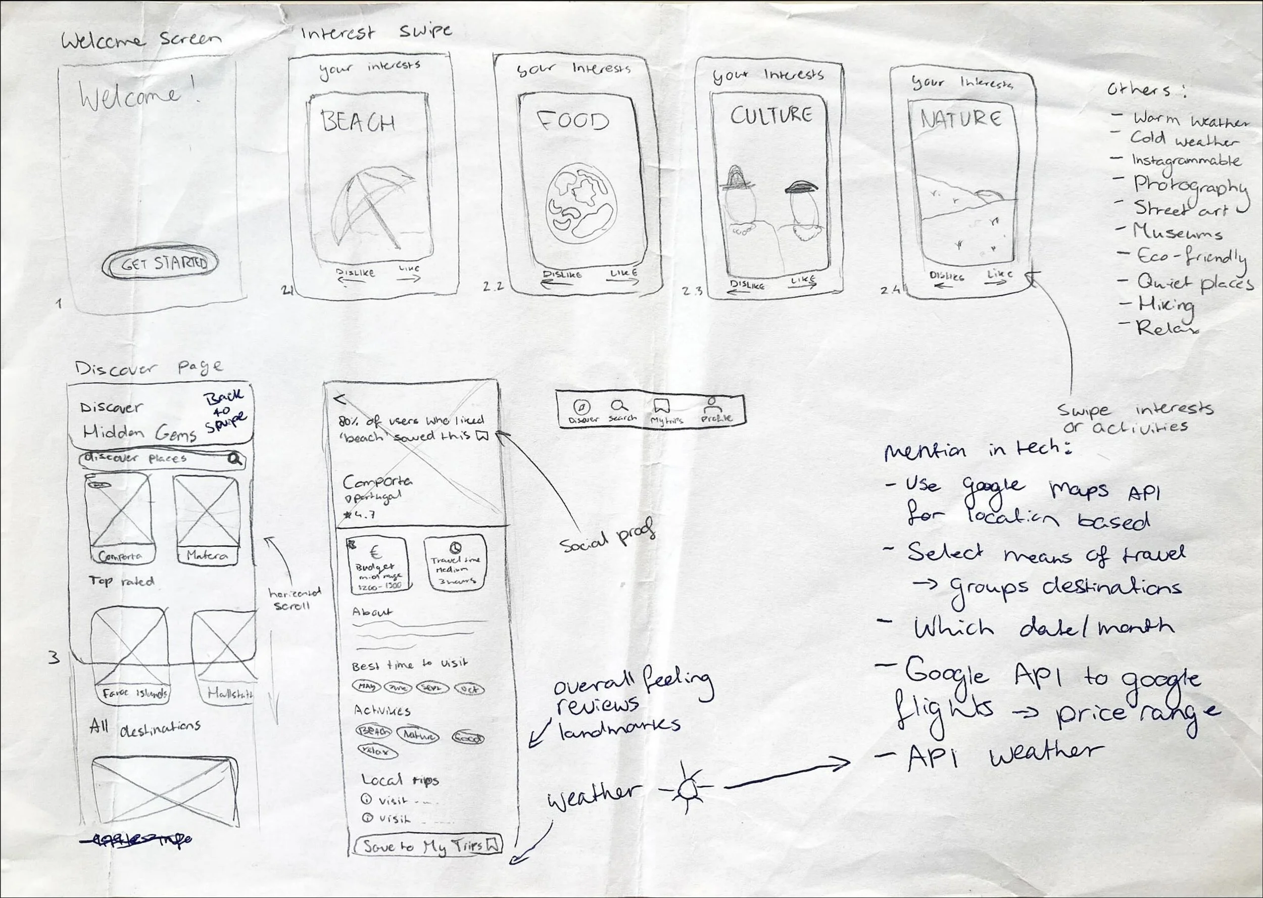
Sketches
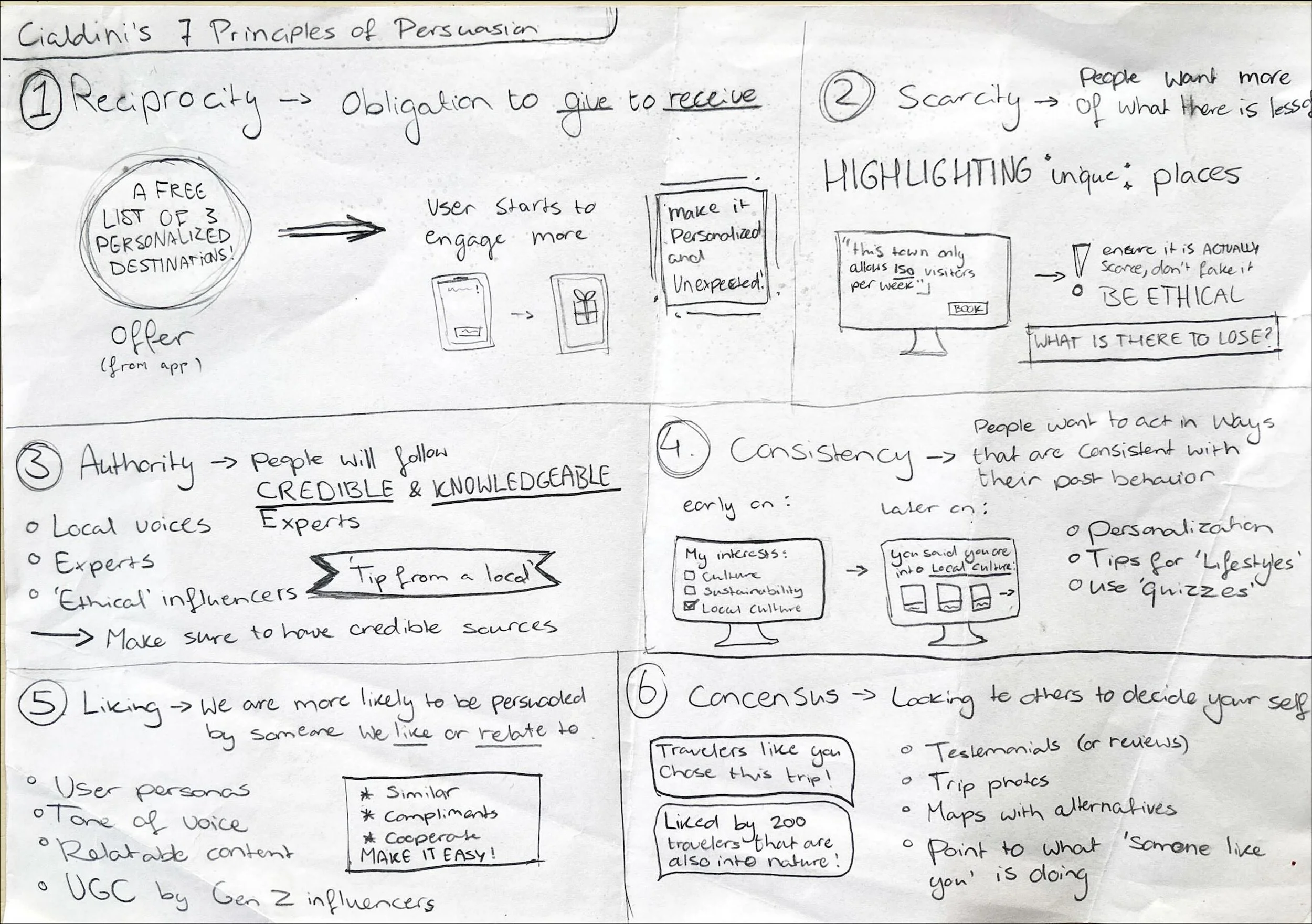
Then, I sketched out how I would like the initial screens to look. This helped me start designing solutions with the opportunity for effortless iterations. Other than the screens, I started brainstorming how I could implement persuasion theory into the concept to attract young people to choose lesser-known destinations.
User Stories
As a traveler, I want to quickly share my interests so I only see destinations that fit me.
As a traveler, I want clear information about lesser-known destinations so I can feel confident choosing them.
As a traveler, I want a simple, visual discovery flow so I don’t have to scroll through endless lists.
As a traveler, I want to save destinations I like so I can compare them later.
As a traveler, I want the recommendations to adjust based on my behavior so the app feels more personal.
Main features (concept)
Swipe onboarding
Swipe-based interface with interests like food, beach, or history
Personalized feed
A feed page based on the user’s interests, with curated alternative destinations
Destination view
A detail page of the selected destination with budget, highlights, tips, reviews, etc.
Profile adjustments
Additional preferences influencing future recommendations over time
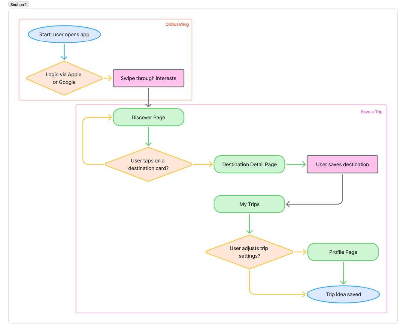
User flow diagram
4. Prototype & Test
Because of the iterative nature of the research, I am combining the prototype and test phase in this case study. In this section, you can see which iterations were made after each usability test round. In total, 14 young travelers aged 18-34 participated in the usability tests, with five participants in the first round, five in the second round, and four in the third and final round.
The prototype images highlight key changes and are not shown fully. You can view the full clickable and swipeable prototypes via this Figma link.
Low-fidelity prototype
What did I want to validate? Whether the core flow and screen structure felt intuitive before adding visual design.
Participant quotes from usability test:
“It's very simple, and I think that's what appeals to people. Everyone knows how it works.”
“At first, I thought it meant how long I wanted to go on a trip.”
“There could be a climate settings option. I can't really handle very humid places.”
“It's exactly what I would love to have in my daily life.”
Key takeaways:
- The concept is appealing to young travelers, and the interface is labeled as simple.
- Some confusing features could be cleared up by subtle changes
- Adding some more filters can make the platform more inclusive
- Fine-tune hierarchy in the discover page
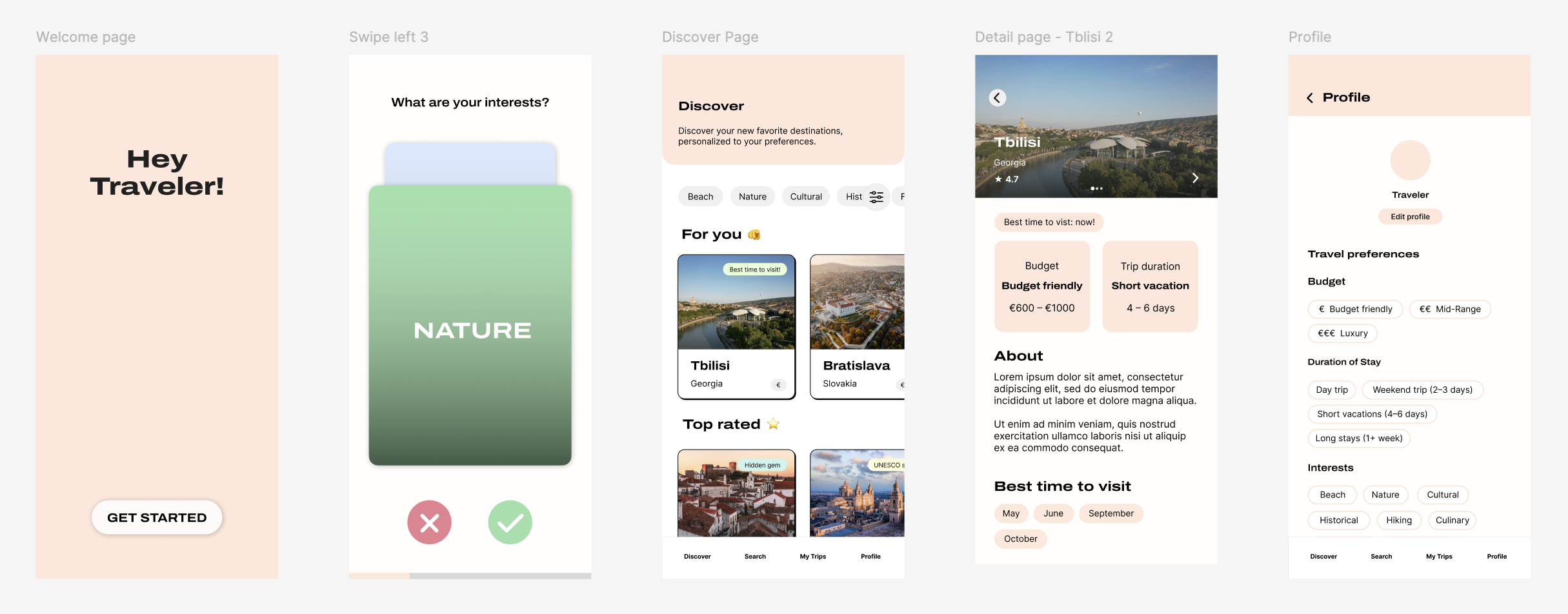
Mid-fidelity prototype
What did I want to validate? Whether the layout, components, and information hierarchy were clear and easy to scan.
Participant quotes from usability test:
“Without having to think too much about it, you are simply guided towards your preferences.”
“It would be nice if the swiping part had pictures as well.”
“The discovery page looks a bit too busy to me. A little overwhelming.”
“It’s not clear to me if I can click on those buttons.” (- about discover page)
Key takeaways:
- Users appreciate the effortless, guided nature of the flow
- Swiping onboarding needs stronger visual support (images)
- The Discover page needs simplification to reduce visual overload
- Interactive elements need clearer affordances to feel clickable
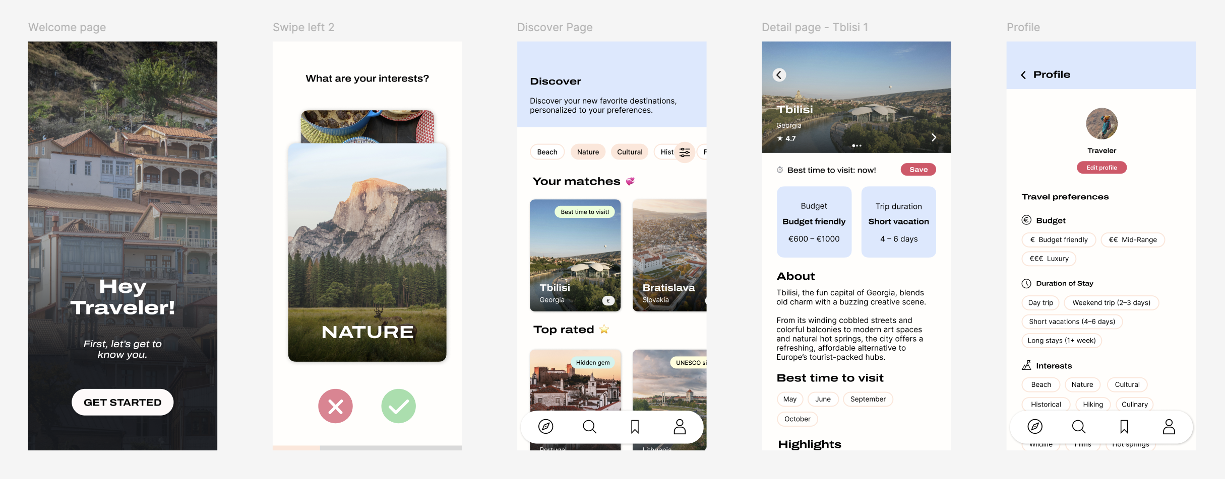
High-fidelity prototype (final)
What did I want to validate? Whether the final visuals, interaction flow, and overall experience felt trustworthy, simple, and relevant to users.
Participant quotes from usability test:
“Maybe if it connects you to sites, which are for booking places, like links.”
“I don’t like long blocks of text, so this is really nice.”
“I would definitely be more inclined to choose a lesser-known location, there is a lot of information about it.”
“Maybe having a map feature here or even Google Maps.”
Key takeaways:
- Users like the short, scannable information rather than long text blocks
- Clear destination details make lesser-known places feel more trustworthy and appealing
- Some users expect optional external links for deeper research or booking
- An additional map view was brought up by one of the participants
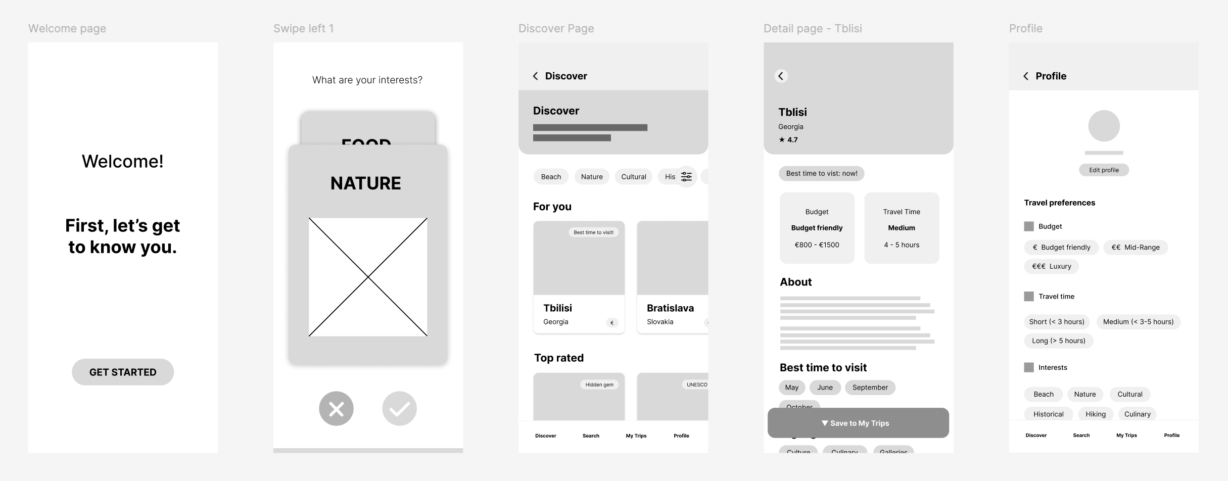
Final screens
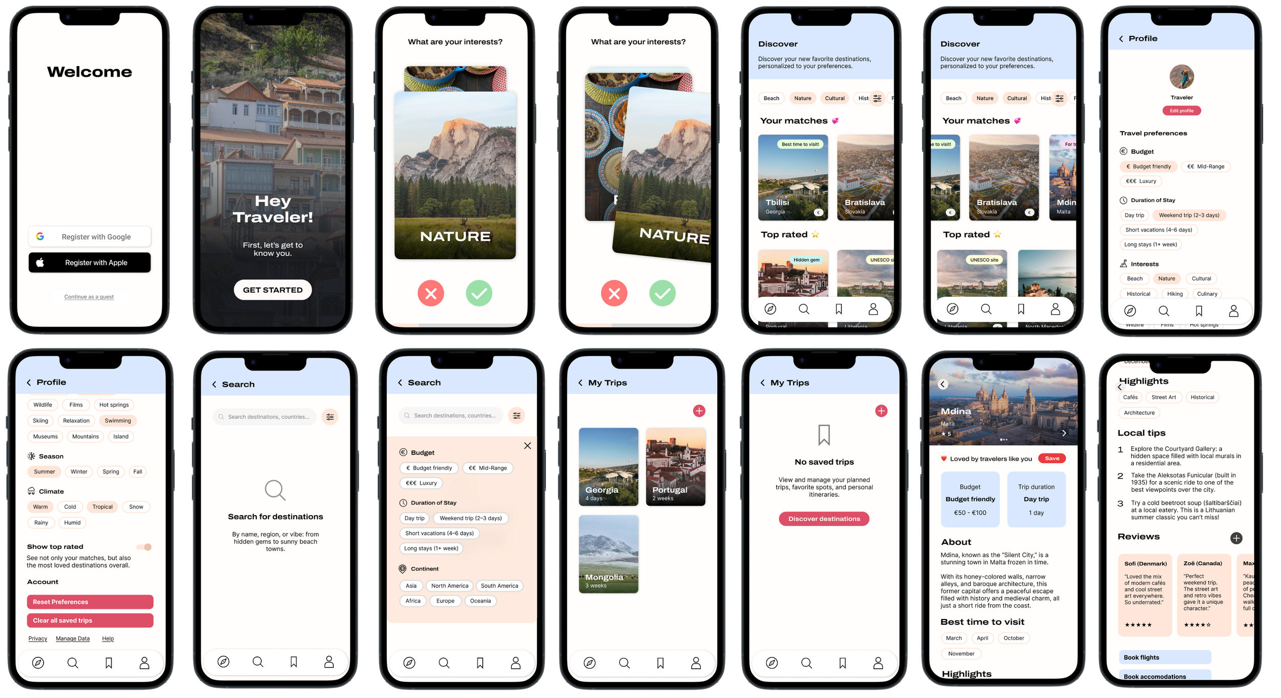
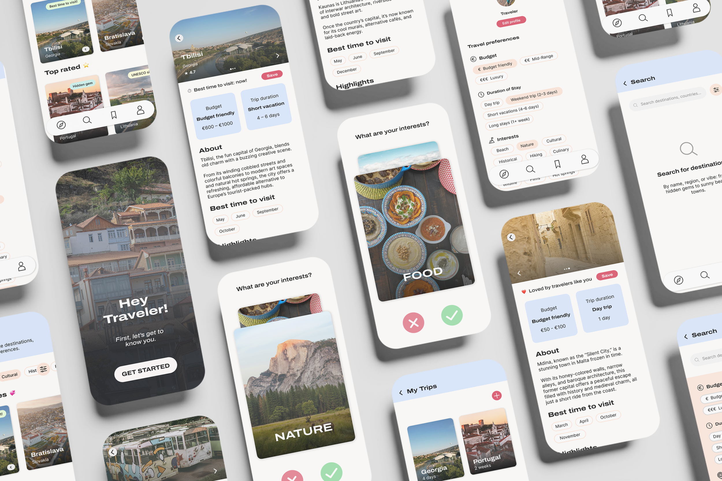
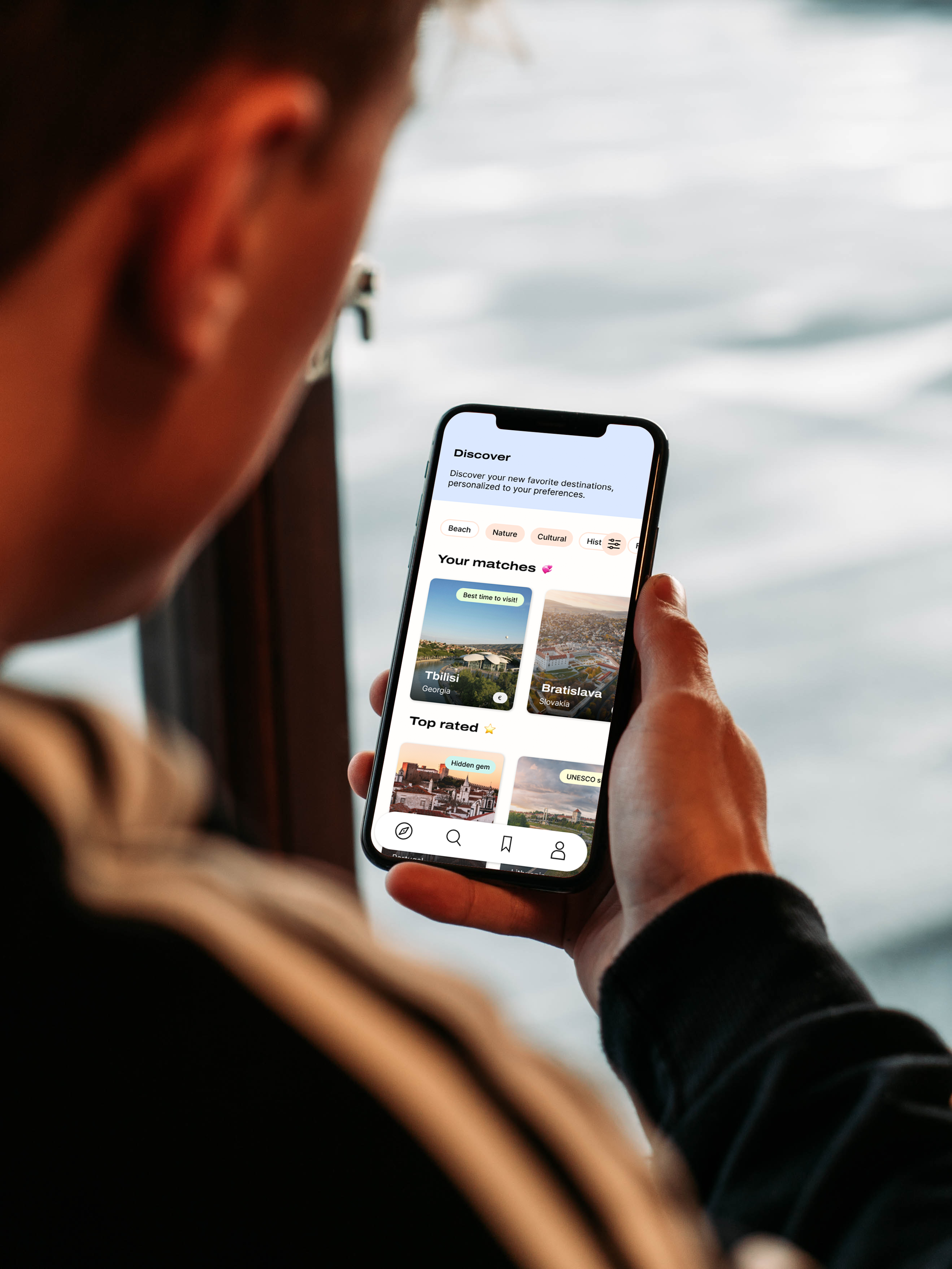
Try out the final Wanderpath prototype below or via this link.
Results
The final design makes alternative destinations feel easier to discover.
Users felt more confident choosing lesser-known places after testing the prototype.
The personalized flow successfully reduced friction during early exploration.
5. Reflection
Looking back
During this graduation project, I:
designed multiple end-to-end flows
produced 60+ wireframes
refined the UI and UX through three usability test rounds
analyzed survey data from young travelers
refined the prototype until it felt effortless to use
What I’m most proud of is how the final experience combines inspiration with solving a part of a real-world problem. It taught me how important early testing is, and how much can change from simple user feedback.
Looking forward
Next, I would love to:
run some more real-world tests with travelers planning an upcoming trip
add a map to discover new destinations visually
work together with local communities and tourist boards
expand the destination library and refine the recommendation logic
There’s still a lot of potential for Wanderpath to grow, and I’d be excited to continue refining it.