Interactive Concept
“Perfect Me”
2023
Interactive storytelling | Concept development | Interface design | Experimental UI
For the Visual Interface Design minor, the assignment was to design an interactive interface experience based on a media case. I chose an episode of the television program Tegenlicht, titled “Perfect Me”. The subject of this documentary is how modern society deals with beauty ideals for women. The ever-increasing "rules" you have to adhere to in order to fit in and be seen as "beautiful" can lead to the loss of friendships, insecurity, and mental health issues.
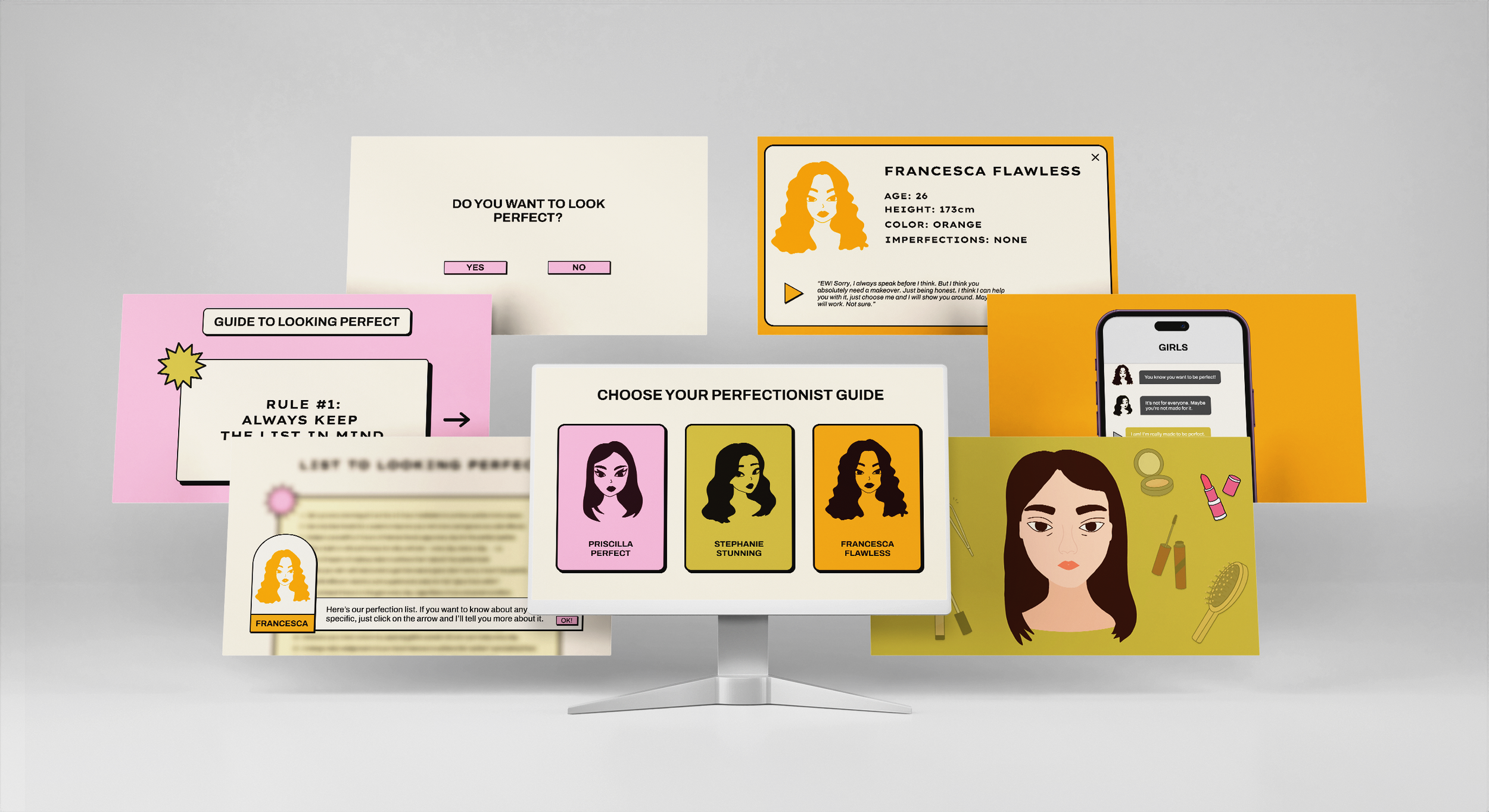
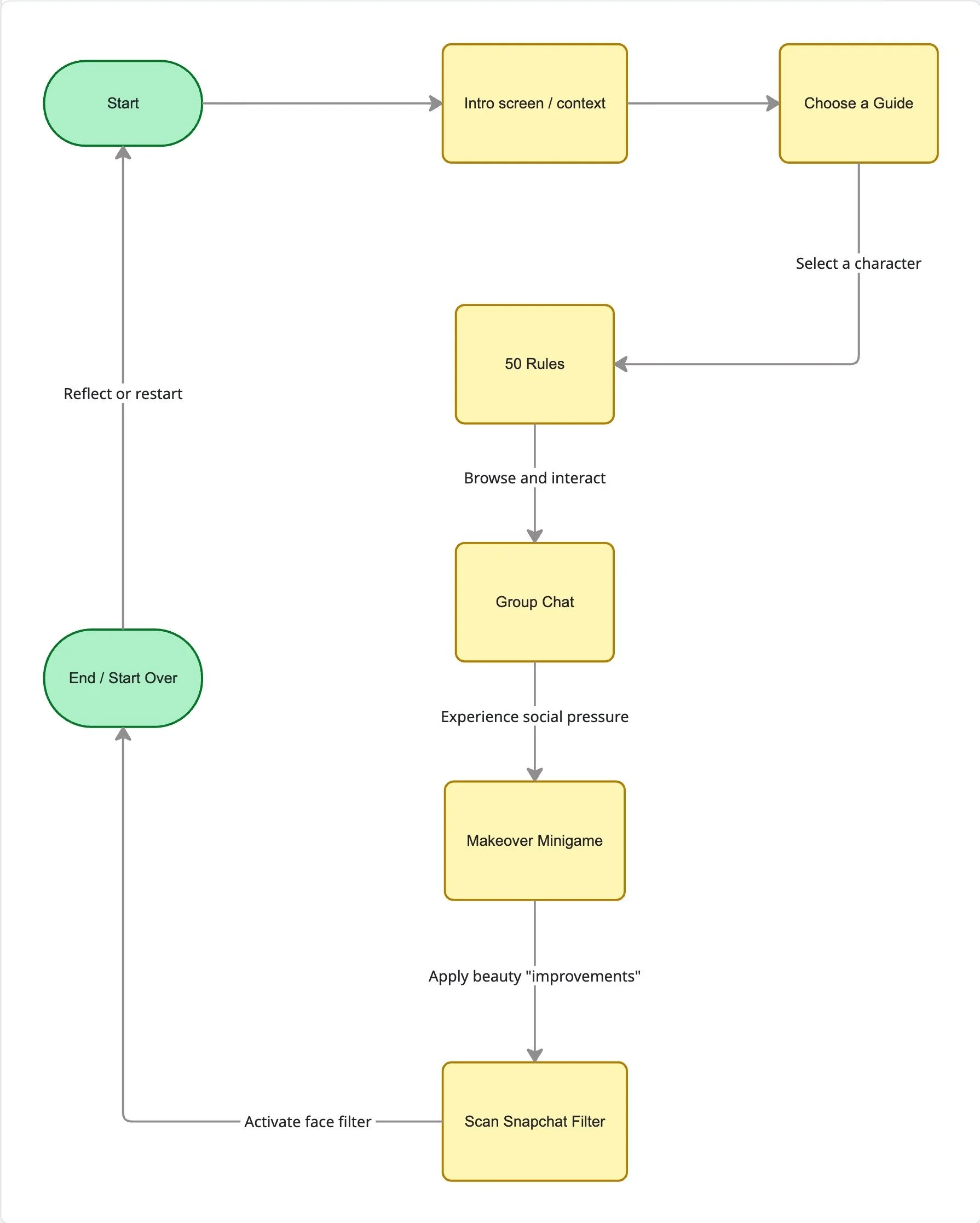
I wanted to transform this problem into an ironic guide that walks you through the rules of perfection. At the beginning of the interface, you can choose your own guide to lead you through the interface. The interface itself consists of several different components: a list of 50 rules for perfection, a group chat where the user can reply, a makeover minigame, and a filter that changes your face.
My Role
Concept Development, Interaction Design, UI & Visual Design
Duration
November 2022 – January 2023 (10 weeks)
Project Type
Study Project
Tools Used
Illustrator, Procreate, Figma
1. The Concept
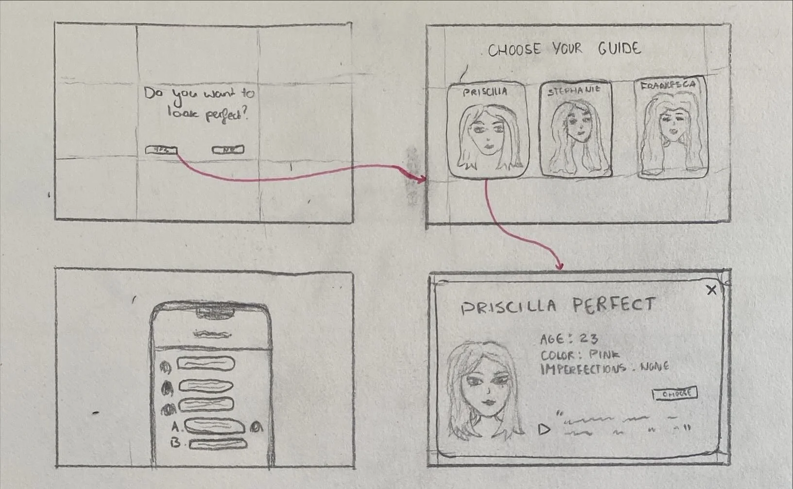
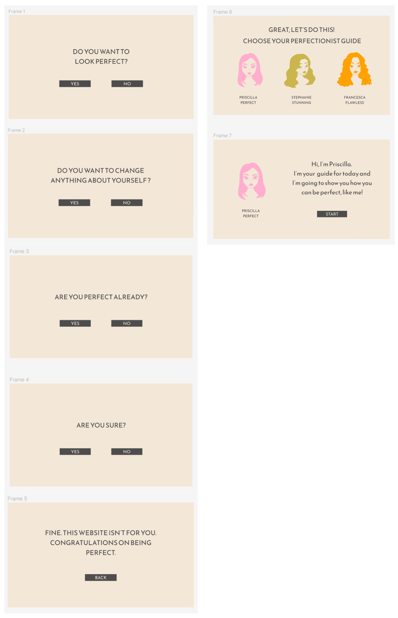
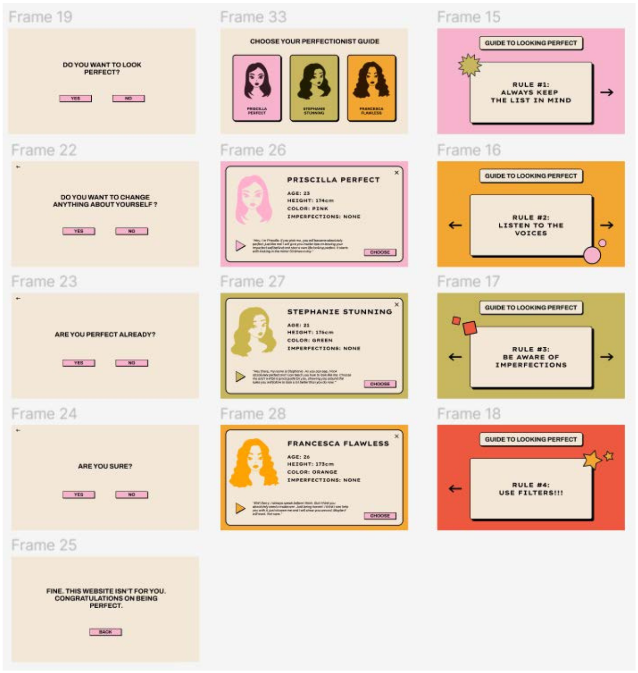
Users pick a (satirical) guide at the start who leads them through the experience. The guides are three separate characters: Priscilla Perfect, Stephanie Stunning, and Francesca Flawless. They all have a personality card shown at the start, so users can get to know them and choose the character that suits them best. Users can listen to a short spoken introduction audio from the characters.
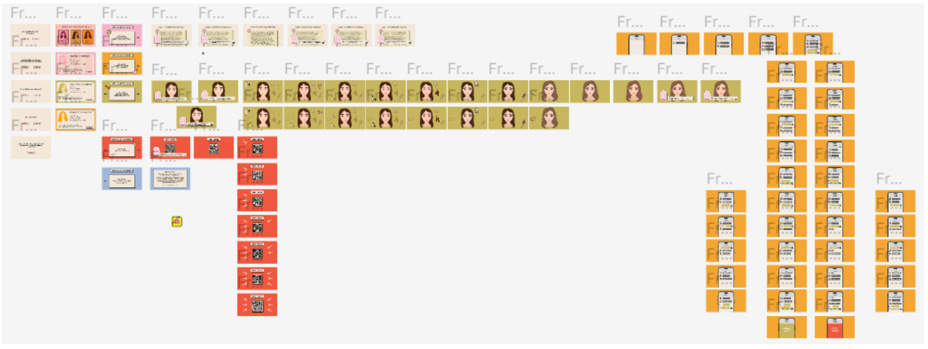
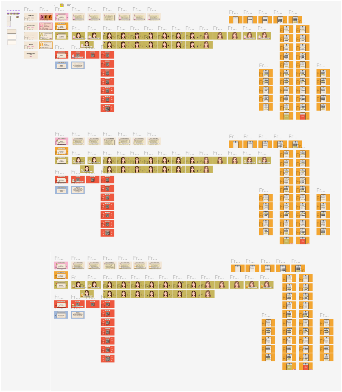
The interface is a multi-component experience that mixes reading, interaction, and play:
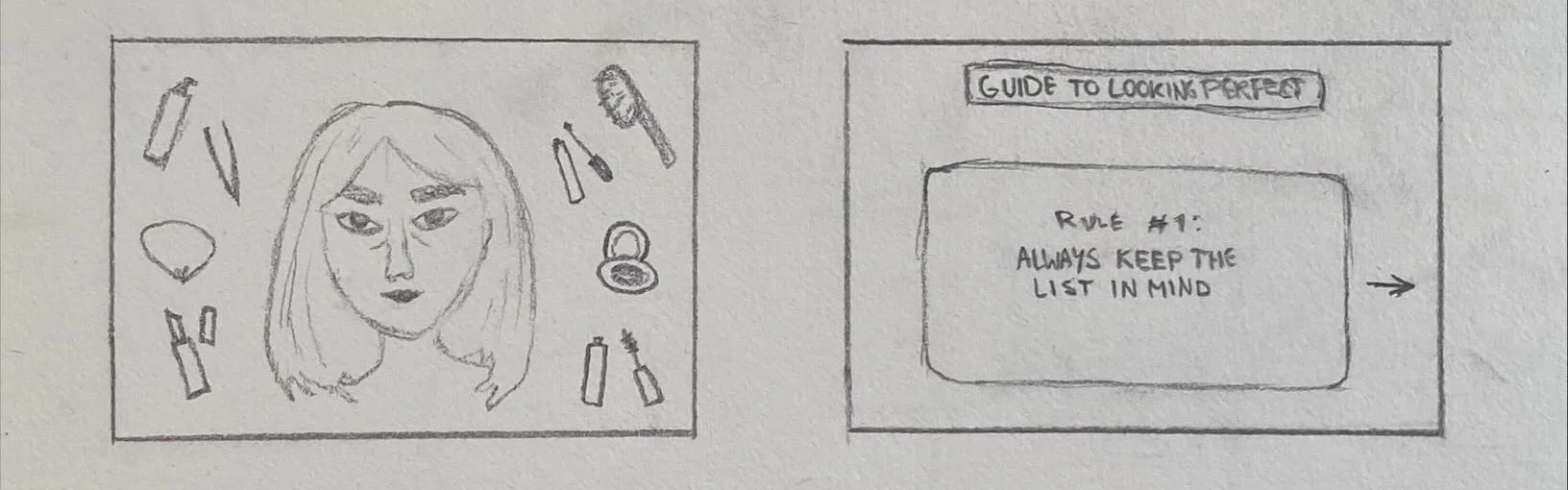
List of 50 Rules for Perfection: a scrollable list of “rules” with some interactive explanations.
Group Chat: a simulated chat where the user can reply and see social pressure in action.
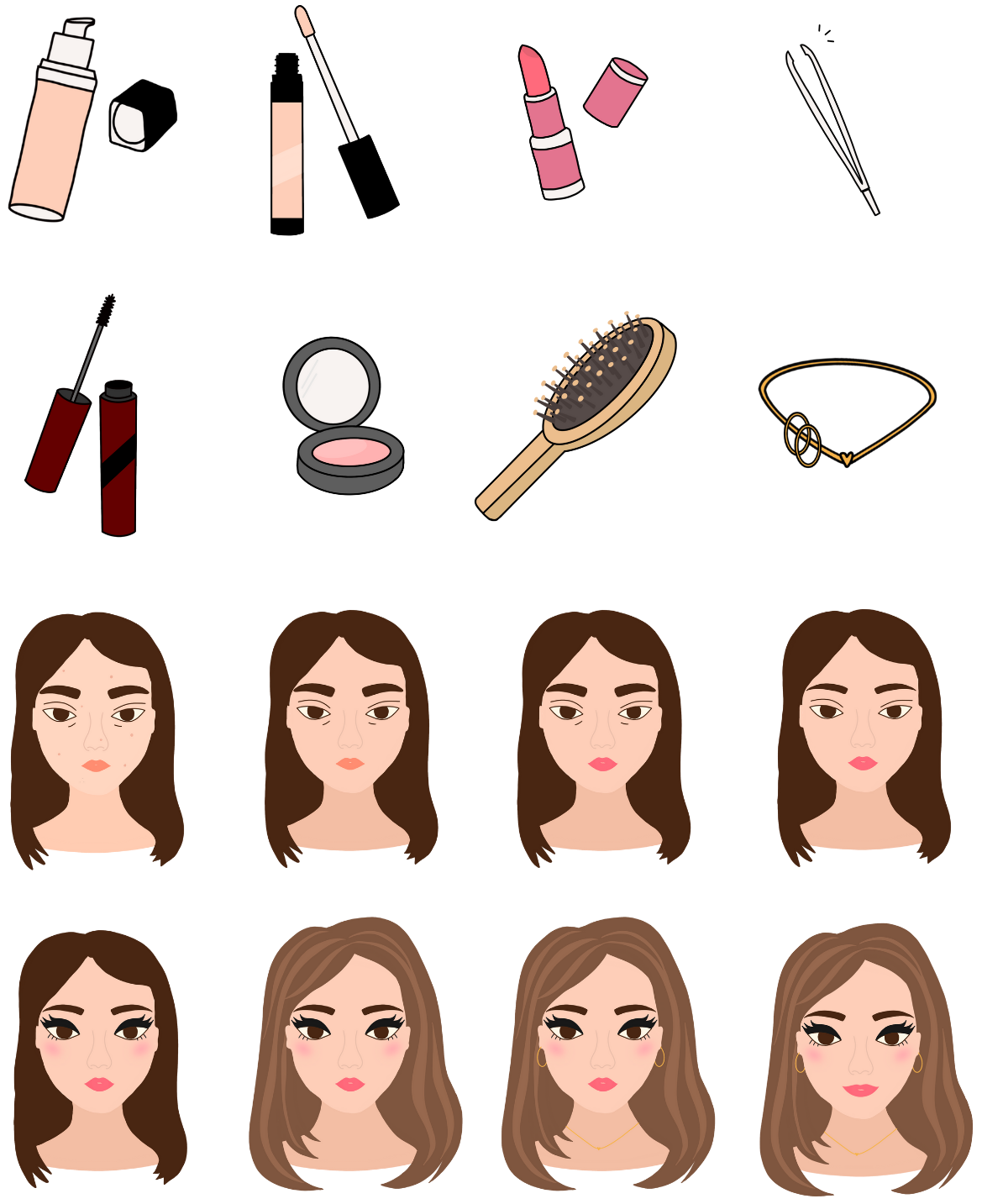
Makeover Minigame: a playful interactive game where users apply hair styling, makeup, and accessories, and see how it changes.
Face Filter: a scannable Snapchat filter you can try out yourself that alters a face to show the illusion of a “perfect” look.
Interaction flow:
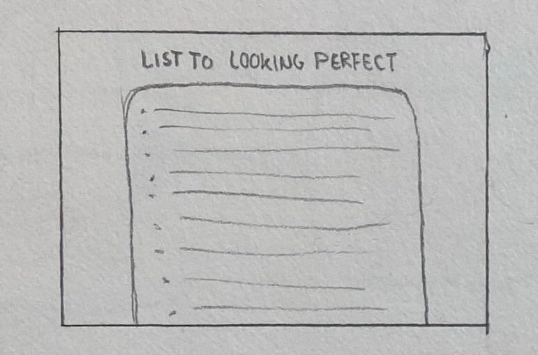
Initial sketches:
2. Visual Direction
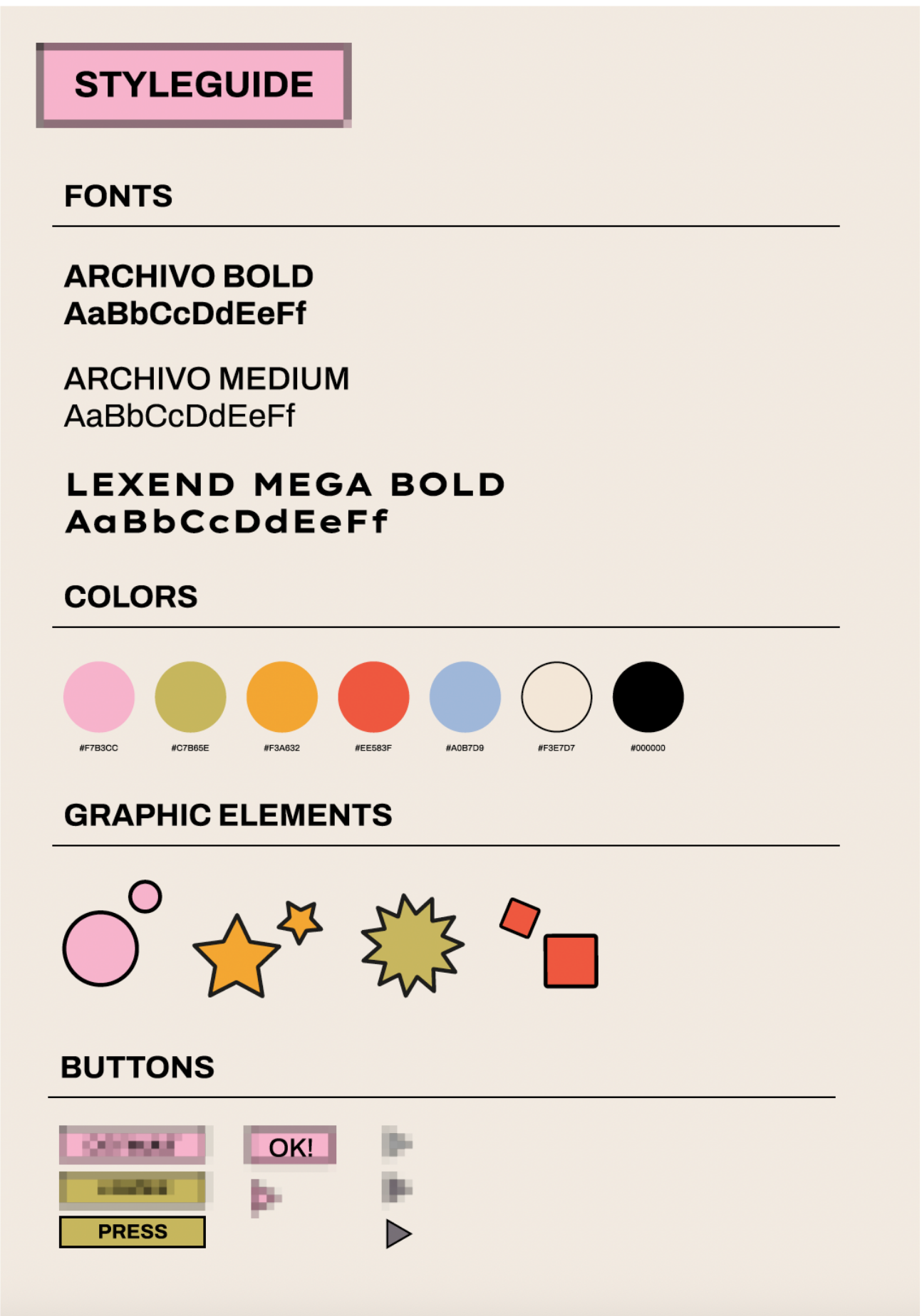
I chose a set of soft but clearly defined colors. The combination of pink and green is inspired by beauty products commonly seen in stores and on social media. These colors also express femininity, which fits the target group of young women.
The overall visual style is based on the trendy Neo Brutalism aesthetic. When selecting typography, I looked for fonts that matched this style while also working well within Figma. During my visual research, I used a style cheat sheet as inspiration and selected two fonts that felt both expressive and readable. I intentionally limited the design to only two typefaces, as the style itself is already quite bold and visually busy. Using fewer fonts helped keep the interface structured and easy to read.
3. First Prototype
After creating the first prototype, I gathered feedback on the clarity, interaction level, and visual strength of the interface. The concept was clear, but the experience needed to become more playful, interactive, and visually outspoken.
Feedback & Iteration
Add a “face game”: I introduced a dress-up / makeover minigame to make the experience more playful and hands-on.
Increase interaction: Static screens were replaced with interactive challenges and micro-interactions.
Character cards: Make characters more interactive or give each character more information.
Stronger visual style: The overall style was refined into a clearer Neo Brutalist direction. A recommendation was to add clearer buttons to the characters.
More defined colors: The color palette was adjusted to increase contrast and visual impact.
4. Second Prototype
This second prototype focused on expanding the concept into a more complete and interactive experience, with multiple cards, interactions, and a clearer narrative.
Feedback & Iteration
Strong concept & originality: The four cards and their interactions (especially the group chat and makeover game) were validated as engaging and distinctive.
Perspective consistency: Feedback revealed that selecting different guides still showed the experience from one perspective. This highlighted the need to further differentiate the characters.
Interaction clarity: It was not always clear that cards and rules were clickable.
→ Added hover effects and visual cues to indicate interactivity.
Flow optimization: Returning to the card overview after each rule slowed down the experience.
→ Introduced direct navigation to the next rule within each card.
Usability refinements: Small UI elements (such as back arrows) were sometimes hard to click.
→ Increased click areas for better usability.
System completeness: The feedback encouraged further development of the remaining characters.
→ Planned expansion of the other two characters to complete the experience.
5. Final Prototype
The final prototype integrates the feedback from earlier iterations and refines the experience both visually and interactively. Based on testing, I clarified clickable elements, improved the overall flow between the cards, and strengthened the visual style to make the interface more consistent.
Navigation between the “rules” was streamlined, allowing users to move directly to the next card instead of having to return to the overview. Hover effects and clearer visual cues were added to emphasize interactivity. The remaining characters were further developed to ensure each guide feels distinct and intentional.
Illustrations made for the Makeover Minigame
6. Reflection
This short project helped me explore how experimental interaction design can be used to communicate critique on a social topic. I learned how incorporating feedback on small usability details and tone of voice influences how a message is perceived. Translating a topic like appearance enhancement to an interactive digital experience challenged me to create something with a clear, serious message in a playful way.